Custom web analytics dashboard with Looker Studio

The challenge
Our client is a healthcare entity offering health plans and resources to those living with mental or behavioral health diagnoses. Their website is a critical touchpoint for members who need to access information to quickly receive care, and providers who need to execute that care. They needed a way to track their web performance and the impact of their campaigns over time.
Our approach
When we redesigned this client’s website, we set up custom analytics tracking using Google Analytics 4. By default, GA4 allows you to track KPIs such as sessions, pageviews, clicks, and more. But like we do with every client, we first created a KPI log to identify each unique conversion goal and each metric that reflected the business impact on the target audience. These performance analytics metrics include things like phone calls to their 24-hour behavioral health crisis line or downloads to important forms and files that help providers conduct their jobs every day.
With our KPIs and goals defined, we set up tracking using Google Tag Manager. Next, we leveraged Google Cloud’s BigQuery product for long-term data storage. This allows us to export data from Google Analytics and into BigQuery so we can call on the data and analyze it. This is an important step because Google Analytics 4 only allows data storage in its platform for up to 14 months. With BigQuery, we can store the data longer, if desired. This enables us to analyze more data over time and do comparisons for trend analysis or forecasting.
After data storage was established in BigQuery, we designed an interactive and user-friendly dashboard report in Looker Studio. (Dashboards can also be created in PowerBI.) We created engaging data visualizations and ways for our client’s marketing team to explore the data on their own. We created useful filters based on traffic channel, campaign, and audience segment. We even pulled in data from other sources beyond the website, such as social media platforms and SEMRush for SEO insights.
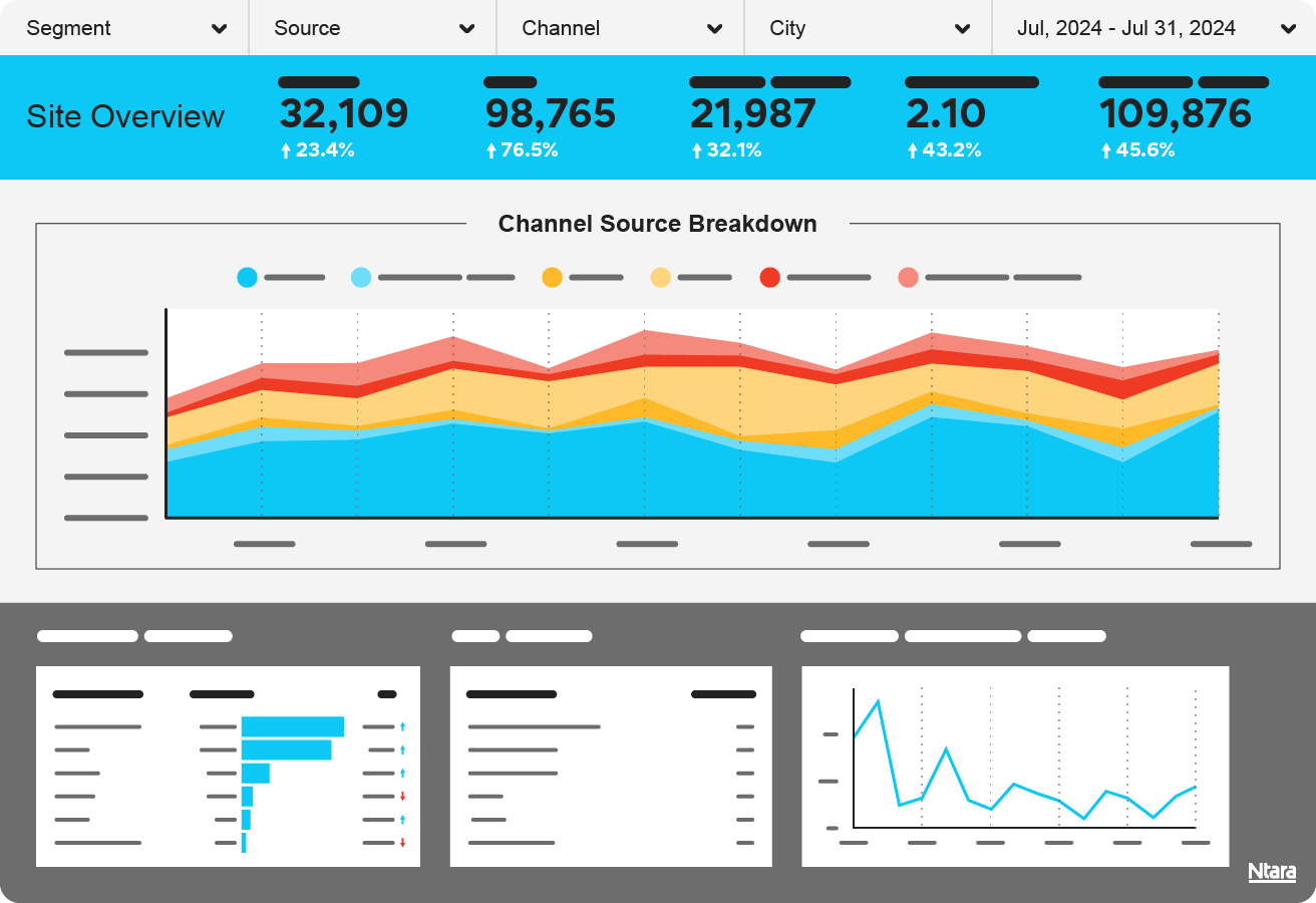
The result
With a comprehensive approach to tracking, storage, and visualization, our client has a reliable source of truth to reference over time. Along with a beautiful front-end experience for the dashboard, they also have the reassurance that their data is accurate and consistent – not subject to the data sampling features that occur inside Google Analytics 4 reporting. With the flexibility of Looker Studio, we can add new pages and visualizations to the report over time. This will help the client further explore and optimize for a great user experience online. And, if they want, the client can also export data.
By the numbers
3
Websites
10
Pages of custom reporting
1
source of truth
Request a quote