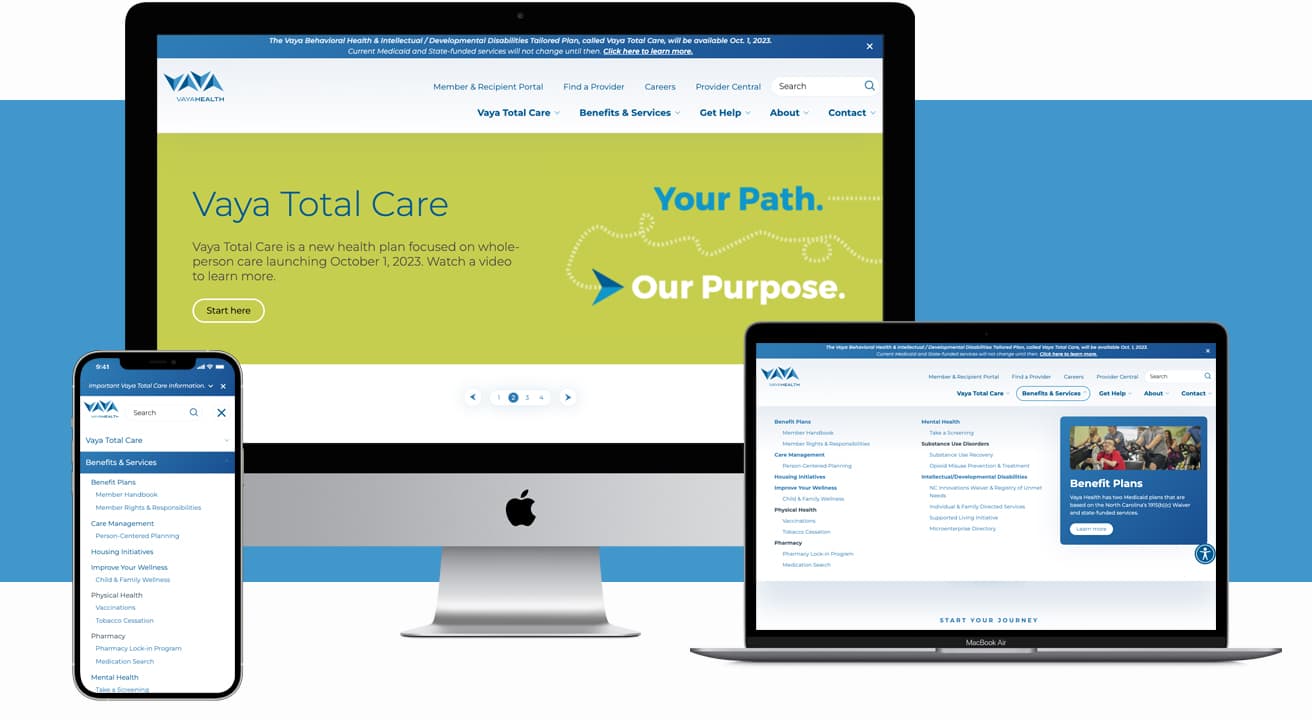
Intuitive navigation drives contact inquiries for managed care organization


The challenge
Vaya Health is a public managed care organization (MCO) that oversees services of North Carolina residents in 31 counties. They help people living with mental health challenges, substance use disorders, and intellectual/developmental disabilities live their best lives. Their website is a critical touchpoint for their members, who access information to quickly receive the care they need.
Ntara worked with Vaya Health to overhaul their homepage, navigation, and footer to ensure key information was accessible, functional, and modern. Prior to our redesign, there were not clear and easy to find CTAs for how to contact Vaya or seek support. Large parts of the navigation had major accessibility issues such as small font sizes, color contrast issues, and lack of aria labels. These factors made the site inconsistent and confusing for sighted users—and virtually inaccessible for those with screen readers or other assistive technologies.
Vaya’s important diagnosis content had vague titles and was buried in the navigation. This proved to be an obstacle for users seeking health resources. Additionally, as a publicly funded MCO, all content was required to pass North Carolina State approval and meet state guidelines. This meant adhering to all accessibility best practices, as well as ensuring users can reach service content within two clicks.

Our approach
We started with a content and UX audit to evaluate important factors, such as personalization, transparency, and simplification. This helped us pinpoint what specific improvements were integral to establishing brand trust and credibility. Next, we audited more technical and accessibility aspects of the existing site. This helped us plan our development approach to ensure a great UX on the front-end for all users.
These scans showed us the navigation color contrast and inconsistent heading layouts did not meet accessibility standards. We decided to use a click-to-view approach which drastically improved accessibility and keyboard navigation. From there, we conducted an SEO technical audit which allowed us to make keyword optimizations that would boost overall rankings.
Lastly, we worked with the Vaya marketing and communications team to develop user-centric content and design engaging page templates to help improve the overall experience. With our strategic refocusing we were able to modernize the tone of the website and achieve optimal usability.
“Ntara’s creative design strategy for our website helped us navigate new requirements effectively. Our new navigation design improved user experience by making it easier for our members and employees to access the information they need. It also helped us adapt to the influx of content that needed to be added to our site during major organization changes.”
Madelyn McNeely
Digital Marketing Coordinator, Vaya Health
Final result
Vaya Health’s navigation redesign provided an intuitive and accessible new layout. We highlighted critical information to increase user engagement, such as crisis and support hotlines and health resource content. We confirmed that color contrast met W3C standards so users could adjust the color contrast levels themselves. To assist visually impaired users, aria labels were added to images. We also added CSS elements to accommodate for screen readers and keyboard navigation. Through our monthly SEO and accessibility scans, we continue to strengthen the site and content to provide crucial support for users in North Carolina.
By the numbers
+114.9%
Contact inquiries
+63.5%
Homepage clicks
-92,320
reduction in SEO issues
+27.4%
Crisis Help pageviews
+12.4%
find a provider pageviews
+18.8%
pageviews to careers content
Ready to discuss PIM?
If you’re ready to standardize your data model to meet the needs of your customers and business, let’s talk.
