Custom inriver user interface boosts PIM adoption by 50%

The challenge
This global tool manufacturer’s story began with a “rescue,” meaning their initial product information management (PIM) implementation wasn’t going as planned and they needed a new implementation partner. That’s where we stepped in.
After solving this company’s most pressing PIM issues, another challenge came to light. Internal users of their software struggled to maintain product data through the platform’s existing user interface (UI).

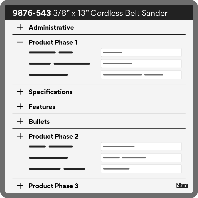
With 2,000+ product attributes and a vast product catalog, the UI presented a maze of specifications. Users described the process as an “endless scroll,” clicking through multiple tabs and collapsible categories to find the right fields.
The data enrichment process was slow and inefficient, causing frustration and bottlenecks in the product launch cycle. And because the UI was so complex, hundreds of users required training anytime a change occurred.
“It wasn’t a sustainable experience for users, so we hit the drawing board,” said David Norvell, Senior Developer & Solutions Architect at Ntara.
“Applying our expertise as inriver Champions, we understood how to harness custom HTML templates to the client’s advantage.”
Our approach
Created from the ground up, Ntara designed a custom UI that transformed how users manage their daily data enrichment tasks.
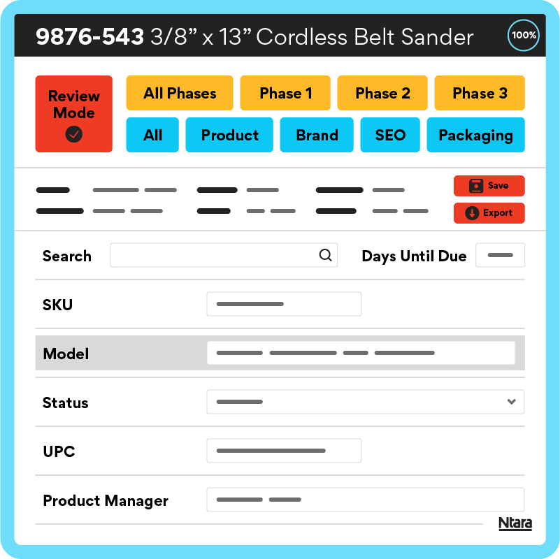
Upon opening the revamped dashboard, a user can now enter Review Mode. This provides a quick view of only the items that are relevant to this user. Once a user opens an entry, they can easily edit and mark for approval.
Our custom advanced filtering offers another advantage. Users can view items related to a specific phase or department with a single click. They can also factor in due dates related to publication and launch dates. This way, users can now track and manage data requirements for each milestone.
The dashboard also enables searching by field name or value, with suggestions that adjust as you type. And while the results are filtered, all data is accessible to users who need context during review.

Final results
Based on initial input, we quickly designed and presented a wireframe for feedback.
“The result was remarkable,” said Norvell. “Just by getting users into the beta experience, we saw the system usability score jump from 30 to 70 on the scale.”
Ultimately, we launched the custom UI in just three months, transforming the user experience. Today, data teams and employees can easily navigate to their relevant fields without the noise of unnecessary information. And with due dates front and center, each user can hit milestones and keep data entry on track.
“Night and day difference between what we were using before! The layout and ability to filter was an absolute game changer.”
Associate Product Manager
TOOL MANUFACTURING Brand
“The new UI has helped a lot. It makes it a lot easier to review what I need to without searching for it, then having to jump around the pages. It’s really nice to be able to edit the things I have to approve. I’m empowered to make grammar edits in copy when needed, which is huge.”
Brand Coordinator
TOOL MANUFACTURING Brand
By the numbers
2000+
product attributes
200+
data entry users
~50%
less time spent in PIM
Leveraging deep inriver expertise and our customization experience, we created an easy-to-navigate, intuitive UI that drives efficiency and user adoption for this global tool manufacturer.
Schedule a call
Does your business need a new PIM partner? Submit the form to speak with a member of our team.
