New navigation and homepage redesign create optimal user experience


The challenge
An outdated homepage and navigation can have detrimental effects on UX and brand perception. For a specialty children’s hospital serving high acuity patients, a website is the last battle a parent or loved one wants to fight.
This children’s hospital’s navigation was rather complicated, resulting in users struggling to view the various services provided by the hospital. It had various accessibility issues, a frustrating page layout, and lack of contact information. This children’s hospital was in dire need of a content refresh and updated web design. By redesigning the homepage and navigation, we gave users a straightforward navigation they could use to locate services and patient resources with ease.
Our approach
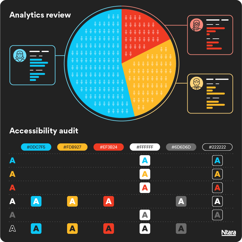
First, we started with an in-depth analytics review. We analyzed how different segments of users were engaging with the current homepage and navigation. This was a critical step in identifying which calls-to-action to feature on the homepage, and what pages to highlight in the navigation.
Because we previously conducted a customer segmentation study for this client, we had all the website traffic segmented by audience type and stage in the conversion funnel. This helped paint a clear picture for our design and strategy team to inform the new UX.
Next, we conducted a sitewide accessibility audit. This audit evaluated the site’s alignment with Web Content Accessibility Guidelines (WCAG) standards to review the highest priority issues. This gave us the insights we needed to create an intuitive homepage and navigation that serves the need of all user types—regardless of ability.

Final experience
We launched a fresh and engaging homepage and navigation, and this client immediately saw an improvement in user engagement not only on the homepage, but also throughout many other sections of the site. We focused on creating an accessible, user-friendly navigation that would help users explore complex content. A month after launch we analyzed user traffic again and saw a positive impact on organic traffic coming to the site, increased engagement to key calls to action on the homepage, and increased pageviews to key service landing pages.
By the numbers
25%
increase in homepage views
83%
increase in clicks to services
17%
increase in calls and appointment requests
Schedule a call
Could customer research improve your ongoing strategies? Submit the form to schedule a no-pressure call.
