The group is – you guessed it – members of the Ntara team. And while we’ll always consider the mountains of East Tennessee to be the most gorgeous place in the world, we’re absolutely mesmerized by the beauty of the Outer Banks.
This trip is one of many our team will complete on our journey to redesigning The Outer Banks Hospital’s website. We’ll spend the next year swimming in provider data, color palettes, SEO keyword research, analytics code, and much, much more to launch the revamped website in the first half of 2017.
But we’re getting ahead of ourselves. Let’s back up a bit and explain how we got here for this hospital website development project.

The data problem
Since the OBH is a partnership hospital of our long-time client Vidant Health—which comprises facilities all over eastern North Carolina—local provider and location information needed to be shared with the larger Vidant Health digital ecosystem.
With Vidant Health’s previous systems in place, it was difficult and time-consuming to gather this information from multiple locations. For example, if a new doctor was added to the OBH, other Vidant Health sites had to be updated manually, one at a time.
Ntara back-end developers cleaned up and connected 17 disparate documents into one central location. This new master database houses information for almost 2,000 providers (with 200 fields of information per provider) and 300 locations.
Once this database was established, the provider information on the OBH site would need to be pulled in from that external source. Our team worked with ODATA and REST protocols to connect to the main Vidant Health database.
Now that the development work is done, other Vidant Health web properties like Vidant SurgiCenter, East Carolina Heart Institute, and the new VidantHealth.com will be able to take advantage of it. Additionally, provider and location data will now be more accurate and less cumbersome to manage.

The content
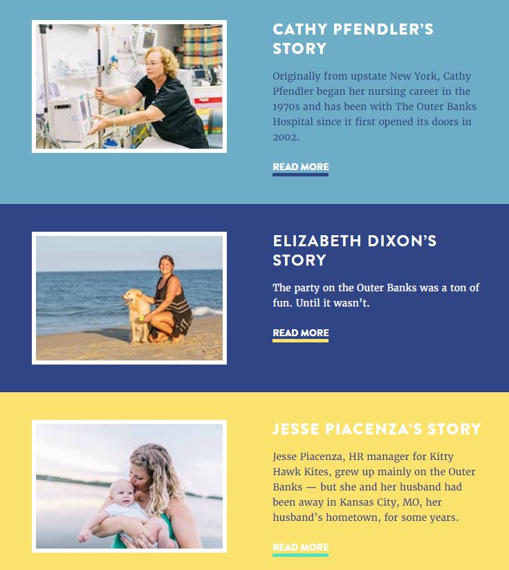
The OBH team members wanted to deepen the hospital’s connection to the community. They wanted the hospital to represent a family atmosphere for long-term residents, with people-focused content highlighting regional services and community topics.
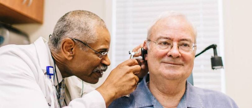
The new site displays local imagery and landmarks and describes the OBH as a “full service, community hospital.” The Stories section uses real names and professional journalistic photography of Outer Banks residents, narrating how the OBH was there for them in a time of need.
The design
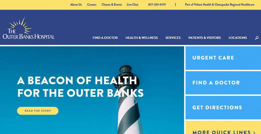
The OBH desired a fresh, compelling look and feel to liven their brand and subsequently the look of their digital marketing assets. While the brand palette called for deep blue and yellow as foundational tones, the OBH decision-makers were open to branching out with other accent colors. Ntara designers kept within the vibrant beach theme, adding seafoam green and lighter blue as part of their healthcare website design inspiration.
The accessibility
If Outer Banks tourists access the OBH website, it’s usually because they need immediate medical services. They’re looking for quick access to services such as Urgent Care, as well as easy-to-reach directions. Mobile optimization is of high importance for this audience, since vacationers often seek information on phones and tablets.
The new site keeps three tourist-related tiles near the top of all main pages: Urgent Care, Find A Doctor, and Get Directions. This ensures that these pages can be accessed with a simple thumb tap and minimal scrolling. And since the site provides an optimal mobile experience, out-of-town visitors can find the information they’re looking for, faster.

The promptness
On trips to the Outer Banks like the one described above, our team captured some breathtaking photography. We were excited to highlight images of the hospital, its team members, and the region on the newly designed website, but we knew that even the most beautiful photos aren’t enjoyable if they take a long time to load.
Our front-end developers used a Javascript polyfill to dynamically manage requests for inline images; it prevents mobile users from downloading larger image files that are typically targeted at desktop users. Automation modules optimize CSS, minify Javascript, and thoughtfully compress all images for production.
The platform
The Outer Banks Hospital’s former website was built on the Ektron CMS, which is becoming obsolete for several reasons. The refreshed OBH site is now on Kentico, which offers several benefits, such as a more search engine-friendly URL string and easy on-page optimization tools.
The outcome
Since the website redesign, The Outer Banks Hospital seen great results:
- 43% increase in sessions
- 79% increase in pageviews
- 81% decrease in bounce rate
From the very first time we visited the Outer Banks to the day the new website reached its completion earlier this year, we knew that this project was really something special. Our team was challenged and inspired by this redesign. It was our pleasure to build a website that captures the true essence of The Outer Banks Hospital, a hospital that embodies the warmth of the community that it serves.
Check out the new Outer Banks Hospital Website and let us know what you think!
Interested in learning more about how we specialize in serving healthcare and institutional organizations? Get in touch. If you’re interested in learning more about our work with Vidant, or how your organization can make an impact through digital transformation, drop us a line.